Public data can contribute to the knowledge of the epidemic but also to the collective response to the epidemic.
To date, 26 data sets related to Covid19 are online on data.gouv.fr. In particular:
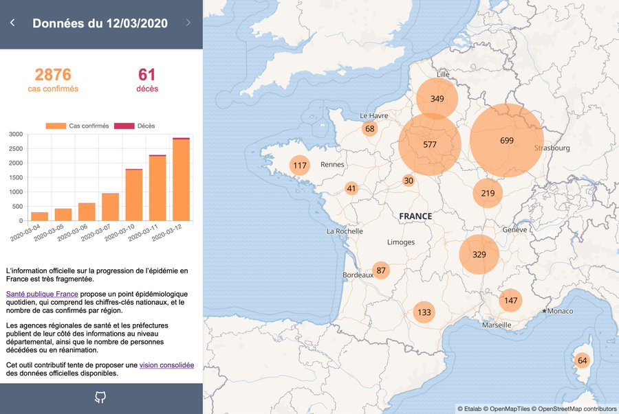
- key figures concerning the COVID19 epidemic in France: a consolidation of official data produced by Santé publique France, the regional health agencies (ARS) and the prefectures.
- Open or closed areas during containment Covid-19
- Signs opened or closed during COVID-19
- Hospital emergency room and SOS doctor data on the COVID-19 epidemic
- Covid-19 Consultation Centers
- Hospital data for the COVID-19 outbreak.
Around Etalab, a community of developers, datascientists, medical professionals of about 200 people undertook to consolidate these data. The contributory tool veille-coronavirus.fr offers a consolidated view of the official data concerning the COVID19 epidemic
14 reuses of these data have already been made: visualizations and dashboards
Among them:
A dashboard which combines data on emergency room flows, hospitalizations and deaths/returns to home. Data on hospitalizations in intensive care units and intensive care units are cross-referenced with capacity data for each department -constructed from hospi-diag-, to better assess the level of saturation of resources. All the graphs can be filtered by department by simply clicking on the map. (Matthieu Louis)
A dashboard of the follow-up of Covid-19 patients in France. The data are mapped by department to respect the granularity of the original data. It shows, among other things, the evolution of hospitalizations, admission to intensive care, deaths, but also returns to home. The dashboard also presents the distribution of men and women and statistics by age group (Gaëtan Lavenu).Map of the evolution of the COVID-19 epidemic. A chronological and geographical evolutionary vision allowing to measure the extent and the diffusion of the coronavirus phenomenon in France (Thibaut Fabacher)COVID-19 data dashboard Worldwide & France.Références :
A Shiny application that allows to follow the global evolution in a tab and then the evolution of the hospitalization in France (since the screening is not automatic). The dashboard is only a first draft of the evolutions in terms of ergonomics, fluidity and the evolution over time for the graphs of the France tab must be added (Clément Parsy).