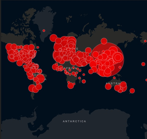
Numerous collaborative projects have emerged around publicly available datasets to provide researchers, public health authorities and the general public with tools and dashboards to track the epidemic.
Many of these projects rely on data sets made available by theJohns Hopkins University (JHU). The data are drawn from a variety of sources, cross-checked with other sources such as the WHO, and are used to maintain a dashboardThe data is also available from the JHU, which is widely quoted in the press. Another high-quality dataset available to the public is the nCoV2019 dataset fromInstitute for Health Metrics and Evaluation University of Washington.
In France,
Public data can contribute to the knowledge of the epidemic but also to the collective response to the epidemic.
To date, 37 data sets related to Covid19 are online on data.gouv.fr. In particular:
- key figures concerning the COVID19 epidemic in France: a consolidation of official data produced by Santé publique France, the regional health agencies (ARS) and the prefectures.
- Open or closed areas during containment Covid-19
- Signs opened or closed during COVID-19
- Hospital emergency room and SOS physicians data related to the COVID-19 epidemic
- Covid-19 Consultation Centers
- Hospital data for the COVID-19 outbreak.
Veille-coronavirus.fr : a contributory tool to consolidate and expose the official data available on the progression of the epidemic in France
Around Etalab, a community of developers, datascientists, medical professionals of about 200 people undertook to consolidate the data of Santé Publique France (daily epidemiological update, national key figures, number of confirmed cases per region) and those of the regional health agencies (ARS) and prefectures. The contributory tool veille-coronavirus.fr provides a consolidated view of the official data concerning the COVID19 epidemic. These consolidated data are available at data.gouv.frRéférence :
The data are available at several levels: world, country (France), region and department. Data at the department level are currently very fragmentary.61 reuses to visualize and give meaning to Covid19 public data available on data.gouv.fr
61 reuses of Covid 19 datasets available on data.gouv.fr were created (as of April 10): visualizations and dashboardsAmong them:
A dashboard which combines data on emergency room flows, hospitalizations and deaths/returns to home. Data on hospitalizations in intensive care units and intensive care units are cross-referenced with capacity data for each department -constructed from hospi-diag-, to better assess the level of saturation of resources. All the graphs can be filtered by department by simply clicking on the map. (Matthieu Louis)
A dashboard of the follow-up of Covid-19 patients in France. The data are mapped by department to respect the granularity of the original data. It shows, among other things, the evolution of hospitalizations, admission to intensive care, deaths, but also returns to home. The dashboard also presents the distribution of men and women and statistics by age group (Gaëtan Lavenu)Map of the evolution of the COVID-19 epidemic. A chronological and geographical evolutionary vision allowing to measure the extent and the diffusion of the coronavirus phenomenon in France (Thibaut Fabacher)COVID-19 data dashboard Worldwide & France.Références :
A Shiny application which allows to follow the global evolution in a tab then the evolution notably of the hospitalization in France (given that the screening is not automatic). The dashboard is only a first draft of the evolutions in terms of ergonomics, fluidity and the evolution over time for the graphs of the France tab must be added (Clément Parsy).A new tool to visualize the effects of containment on air quality on a daily basis
The French National Institute for the Industrial Environment and Risks (Ineris) has just put online a new tool which allows to visualize daily the effects of confinement on the concentrations of nitrogen dioxide and particles, regulated pollutants known for their deleterious effects on health.
An interactive interface allows to visualize the concentration forecasts of these two pollutants, according to two assumptions: on the one hand, considering the emissions, all activity sectors included, estimated in normal situation in 2020 (called Reference Case) and on the other hand, considering a reduction of emissions associated with the containment (situation called Containment (Covid-19)) These two assumptions allow to build emission scenarios. These scenarios are integrated as input data, with the meteorological forecasts of the day, to the Chimere air quality model. Chimere is co-developed by CNRS and Ineris since 2001, and simulates the evolution of atmospheric pollutant concentrations, taking into account the chemical reactions that take place in the atmosphere.The exceptional situation created by the decision of confinement applied in France since March 12, thus makes it possible to confront the models used until now in a theoretical way, with a real situation of decrease of the human activities.
Référence :
Sources
- 1. Dashboard for monitoring the epidemic: veille-coronavirus.fr
- 2. Dashboard for monitoring the epidemic: veille-coronavirus.fr
- 3. Data.gouv.fr : official data concerning the COVID19 epidemic
- 4. Data sets and reuses on data.gouv.fr
- 5. Containment and the environment: a new tool to visualize the effects of containment on air quality on a daily basis


